
I presented JulieDx to a room full of marketers who use Claude every day. One question followed me home: why doesn't your site look like it was designed by AI?
Fair question. AI-built stuff has a look. You know it when you see it. The interchangeable layouts, the stock imagery of people who almost look real, the design that could belong to a project management tool or a dog walking app. It's not ugly. It's just nobody's.
Here's the real answer. My site doesn't look AI-designed because the brand existed before any AI tool touched a pixel. The brand strategy, the identity, the voice, the visual rules about who this brand is and isn't. All of it was decided first. By the time a tool generated anything, it was executing a brief, not guessing at one.
This article is the process, step by step, with the prompts you can copy and my real outputs as examples.
One thing on scope, because I want to be honest about it. I'm not a brand designer. I've spent 15 years in senior marketing roles working alongside people who do this for a living, and I've watched full rebrands happen from the inside at Fortune 500 scale. This process won't replace a professional brand team. But a brand with your own name on it is a much smaller problem than that. If you're a solopreneur, a consultant, a fractional exec, or a small agency, this process will get you something coherent, professional, and genuinely yours.
Step 1: Get interrogated
The foundation of a brand isn't a color or a font. It's a small set of truths about what your business does to the person on the other side of it: how it makes them feel, and what it sets them up to expect from you every time they come back. You probably know these truths already. The problem is they're sitting in your head unexamined, and unexamined instincts produce vague briefs.
So the first move is to have the AI interrogate you. A real back-and-forth where it asks, you answer out loud in your own messy words, and it pushes back when your answer is fuzzy. I used Claude for this, and it was the single highest-value part of the entire process. The questions forced me to say things I knew but had never articulated, and the follow-ups caught the places where I was giving answers that sounded good instead of answers that were true.
Here's the purpose behind each question, so you can answer them well:
- How do you want your product to make people feel? This comes first because everything downstream serves it. If you can't finish "right after someone experiences my product, they feel ___" in plain language, no visual decision can be made yet.
- How does your brand relate to the people it serves? Register and hierarchy. A peer talking across the table, an expert at the front of the room, a coach walking alongside? Copy, tone, and layout inherit from this answer.
- What brands do you actually respect visually? This surfaces your taste, which is real data even when your first answer is messy. Mine was, as you'll see in the next step.
- What is your brand not? The anti-reference. Rejection is instinctive and honest. You'll hesitate on what you love. You won't hesitate on what makes you cringe.
- Dark or light? A forced binary that sets the temperature of everything visual. Pick one as dominant even if you'll use both.
- What does having your product feel like in someone's life? Answer with something real from life, not a category or a benefit statement, and it'll tell you the emotional register your brand needs to hit.
- What's the one word? The compression test. If people describe your brand to someone else in a single word, which word did you build for?
- What survives? If you already have colors, fonts, or a logo, be honest about whether anything stays. Sunk cost is not a brand strategy.
Here's the prompt. Paste it in and answer honestly, ideally by talking out loud with voice-to-text, because your spoken answers are less polished and more true:
I'm building the brand identity for [your business]. Before we touch any visual tool, interrogate me. Ask these questions one at a time. If my answer is vague or generic, push back and ask a sharper follow-up instead of accepting it.

1. Right after someone experiences [your product/service] for the first time, what do they feel? Finish the sentence: "Oh ___."
2. How does this brand relate to the people it serves? A peer talking across the table, an expert at the front of the room, a coach alongside them? Describe the relationship in your own words.
3. Name three brands, any industry, whose visual identity you actually respect. Not because you love the product, because it looks like someone built it on purpose.
4. What does this brand absolutely not look like? Give me the anti-reference, the aesthetic that would make you cringe if someone said "it reminds me of yours."
5. Dark or light as the dominant mode? Pick one, even if you'll use both.
6. What does having this product in your life feel like? Answer with something real from life, not marketing language.
7. What's the one word you want people to use when they describe this to someone else?
8. If you already have colors or fonts, be honest: does anything stay, or do we start over?

After I answer everything, synthesize: tell me what emotional territory this brand owns, what its persona is, its one word, and its anti-reference. Then tell me directly if any of my answers contradict each other.
My run: what the interrogation produced for JulieDx
My answer to the first question, roughly verbatim: "Oh wow, this is really helpful. I was kind of thinking this but wasn't sure, and this confirms it." That one sentence became the emotional territory for the entire brand: confirmed certainty. Not excitement, not inspiration. The specific relief of half-knowing something and finding out for sure. Every design decision afterward got tested against that feeling.
On the relationship question, I said JulieDx is a brilliant friend who tells you the truth. She has the intelligence of a professor, but she's your friend, and she's just going to tell you honestly how it is. That became the persona: the brilliant friend. Deep expertise, zero hierarchy.
The anti-reference question is where I described the thing I'd been circling for years and finally named: the marketing bro funnel. If you haven't heard the phrase, it's because I coined it. It's the aesthetic and mechanics of the guys who sell making money online: the long scrolling page that hammers benefits, the countdown timer, the "price goes up at midnight" urgency, the free course that funnels into a paid course. Marketing built entirely on pressure. My buyers are senior marketers who have spent their careers seeing behind that curtain. If my brand carried even a trace of that aesthetic, they'd close the tab. So "the opposite of the marketing bro funnel" became the clearest constraint in the whole system.
On what having the product feels like, I said: financial security. Knowing you're going to be okay no matter what, so you never have to worry. That answer did more design work than any mood board, because it set the emotional register at quiet confidence. Something that's already working in the background and doesn't need to perform. A brand that needs to shout is a brand that isn't sure. Mine had to feel sure.
The one word: brilliant. From that point on, everything visual and verbal had to earn that word or get cut.
Here's an excerpt from the brand territory brief Claude synthesized from those answers:
What JulieDx makes someone feel: Confirmed certainty. Not excitement. Not inspiration. The specific relief of "I already half-knew this, and now I know for sure, and I know exactly what to do." The feeling after a brilliant friend looks at your work and tells you the real thing. You walk away not energized. You walk away clear.
The physical object: A trust fund. The specific feeling of knowing you're financially okay no matter what. Not because you're rich, but because you made a smart decision that's quietly working for you in the background. The brand should feel like that kind of security. Reliable. Intelligent. Already there when you need it.
Anti-reference: The digital marketer bro funnel. Long scrolling pages. Artificial urgency. Countdown timers. "Only 3 spots left." Free course to paid course to upsell. If someone looks at JulieDx and thinks of that world, the brand has failed.
Step 2: Pressure-test your answers
Here's the problem with Step 1: at least one of your answers is vague, and you can't see it. To you it feels clear. But everything you build next gets built on those answers, so one vague answer quietly makes every decision after it vague too.
The fix is simple. Before you touch a visual tool, paste your answers back in and make the AI stress-test them:
Here are my answers from the brand interrogation: [paste your answers]. Pressure-test every one of them. Go answer by answer and tell me which ones are specific enough to build on and which ones sound specific but aren't. For each weak answer, give me two clearly different directions that could both fit what I said, described in plain language, not brand jargon. Describe what each one looks and feels like concretely. Make me pick before we move on.
Here's what that caught for me. On the reference brands question, I gave the most basic bitch answer possible: Nike, Apple, and Google. All brands I genuinely respect. Also completely useless as a set, because they point in three different directions. Nike is bold and emotional. Apple is obsessive minimalism. Google is playful primary colors. Naming all three is the same as saying nothing. I couldn't see that until it was pointed out. That's the whole reason this step exists: you can't catch your own fuzzy answers. Something outside your head has to.
My run: the fork this produced, and the doubt it settled
For me, that produced a fork: obsessive restraint (very few elements, huge white space, one color used with precision, feels expensive because of what's not there) versus confident editorial (clean but with personality, rich color used intentionally, feels like a smart publication or a premium professional tool). Two legitimate directions, both consistent with my answers, impossible to pursue at the same time. I picked confident editorial, and for the first time I actually knew what I meant instead of gesturing at three brands.
This step is also where you should voice your real doubts, because a doubt you don't say out loud becomes a decision you second-guess forever. Mine was this: if every competitor in my space uses the loud urgency aesthetic, maybe there's a reason. Maybe it works and I'm being naive by refusing it. Working through that out loud produced the answer that made the whole brand make sense. The urgency aesthetic works on high-volume, anonymous, low-trust traffic making fast emotional decisions. My buyers are the opposite: senior, skeptical, and experienced enough to recognize every one of those tactics on sight. For them, a brand that refuses to perform urgency is itself the trust signal. I wasn't sounding different to be different. I was sounding different because my buyer is different.
I also didn't leave this as a one-person opinion. I'd been having real conversations with the exact people I'm building for, fractional CMOs and agency owners, and I pulled what I learned from those interviews into this process. When your gut and your customer conversations point in the same direction, you can stop wondering if you're right.
Step 3: Build the voice on purpose
This is the step I most want you to steal.
The standard way to build a brand voice is to pick adjectives. Professional. Approachable. Bold. Then someone tries to write copy "in that voice" and it sounds like every other company that picked the same adjectives, because adjectives aren't a voice. A voice is a set of mechanical patterns: how you open, how you close, your sentence rhythm, what you do when you're admitting a gap, which words you'd never say.
So build the voice as rules. And be clear about one thing first: a brand voice is a persona. It's a person, real or invented, with a consistent way of talking and rules around it. Sometimes that person is you. Sometimes it's a slice of you. And sometimes it isn't you at all: the brand is its own character, and you decide who that character is.
Mine is me. JulieDx speaks in my voice, so inventing a character would have been the wrong move. If your brand carries your own name, do what I did: extract the voice from your real writing. If your brand is its own persona, skip to the second prompt below and define the rules deliberately. Either way, what you're building is the same thing: a rulebook, not a vibe.
If the brand is you, one decision comes first: which version of you is the brand? Your brand voice doesn't have to be your everyday voice, and it definitely shouldn't be all of your voices at once. Mine is a slice of me. It's not Julie presenting in a boardroom. It's Julie telling it how it is to someone at her level, maybe a level up. Casual, direct, peer-to-peer. Once I named which version of me the brand speaks in, I knew which writing samples to feed the analysis: the casual, unperformed ones, not the polished ones.
That's the rule for your raw material in general. Don't feed it your published stuff, because your published stuff is already performed. Feed it the writing where you weren't trying: emails to people you trust, messages, voice-to-text notes. Twenty real emails will surface your patterns.
Here are real messages I've written: emails, chats, voice-to-text notes. This is unpolished writing where I wasn't performing. My brand speaks in the version of my voice I use when [describe the setting: e.g., talking to a peer I respect], so weight those samples most. Analyze how I actually talk, not how a brand voice guide says I should sound. Find:

- How I open a message (warmup or straight in?)
- How I close
- My sentence rhythm (uniform length, or a pattern?)
- Whether I hedge or state things directly
- How I handle admitting a gap or a mistake
- Words and phrases I actually use repeatedly
- Words and phrases I would clearly never use

Then give me a voice guide with real examples pulled from what I actually wrote, not invented ones. Format it as rules someone else could follow. Flag anything you write for me in the future that breaks these patterns.
If the brand isn't you, the same principle holds. A voice is rules, not adjectives. You just decide the rules instead of extracting them:
Help me define a brand voice from scratch. Ask me one at a time: who this brand talks to, what relationship it has with them (peer, expert, coach), and what it should make them feel. Then ask me for two or three pieces of writing in voices I admire and have me say what I like about each. From my answers, define the voice as mechanical rules, not adjectives: how it opens, how it closes, sentence rhythm, how it handles admitting a gap, ten words or phrases it uses, ten it never uses. Then show me the same short message written twice: once in this voice, once generically. Format everything as rules someone else could follow.
My run: what the analysis found, and my voice card
What mine found. I open without warmup. No "hey, so I wanted to ask." I just start with the thing. I name specifics instead of categories: a company by name, not "a health plan," a number, not "a while." I state a gap once, plainly, and move on instead of over-explaining. Contractions always. And my rhythm isn't uniform: short punch, longer sentence to develop the idea, short close.
That analysis became a voice card, which is the artifact you're building in this step. Mine has four defined traits (brilliant, grounded, direct, warm, each with a real definition, not just the word), the setup phrases I actually use to open an observation, the phrases I use to name a problem, a rhythm rule, and a framing rule: every fix is described as a present-tense loss, not a future opportunity, because "this is costing you right now" is honest and "this could improve results" is wallpaper.
Two rules in mine worth calling out because they show what a real voice card does. First, hard bans: no em dashes and no exclamation points, anywhere, ever. Em dashes are the biggest tell of AI writing there is, and a brand built with AI tools can't afford to sound like one. Second, the card includes side-by-side examples of on-brand versus off-brand copy for the same message, which turns the voice from a description into a test anyone can apply.
Here's an excerpt from my actual voice card:
Brilliant. Sees the thing others missed and names it plainly. Not clever. Not witty. Clear and correct in a way that makes you think "oh, obviously."
Warm. On the user's side. Not flattering. Not cheerleading. The warmth of someone who's honest with you because they're actually trying to help you.
Setup phrases: "Here's the thing..." "The reality is..." "If I'm being honest..." "Julie's read:"
| On-brand | Off-brand |
|---|---|
| "Find out if it works before you hit send." | "Optimize your email performance before deployment." |
| "A grade, the real problem, and what to fix first." | "Comprehensive diagnostic insights with prioritized recommendations." |
| "Stop sending things into the dark." | "Eliminate guesswork from your marketing process." |
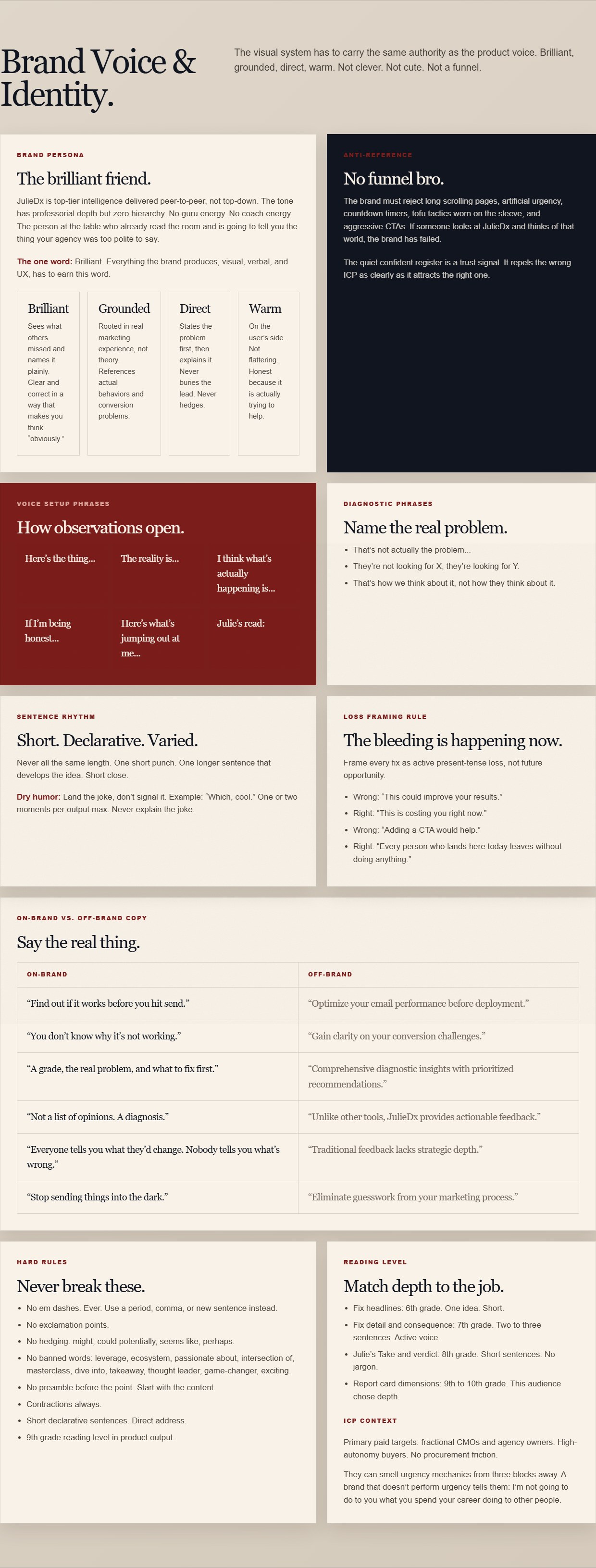
The voice, locked into the design system where every future piece of copy gets checked against it.
Step 4: Generate visual territory, then force the decision
Now the visual work. And the first rule is: don't generate a logo. Not yet.
A logo is the most compressed visual decision a brand makes, and you don't have the information to make it. What you need first is territory: the visual world the brand lives in. Colors in context, typography with attitude, the overall temperature of the thing. Mood boards, not marks.
The second rule: generate multiple named directions, and make each one a test of a specific question. Because I had a written brief, I could design each direction to answer something I genuinely didn't know yet, instead of generating variations at random and picking whichever looked nice that day.
I ran the mood boards in Midjourney. The tool matters less than the brief. Here's the prompt structure:
Brand identity mood board for [type of business]. [Dominant background: light/dark, specific tone]. [Base colors]. One sharp accent: [accent color] used on key elements only. [Typography direction: e.g., strong serif display, clean sans body]. Feels like [the emotional register from your interrogation]. No illustrations or icons, pure typography and layout. Absolutely not: [your anti-reference, described concretely]. [Three closing adjectives from your brief].
I ran four directions, and each was a named experiment:
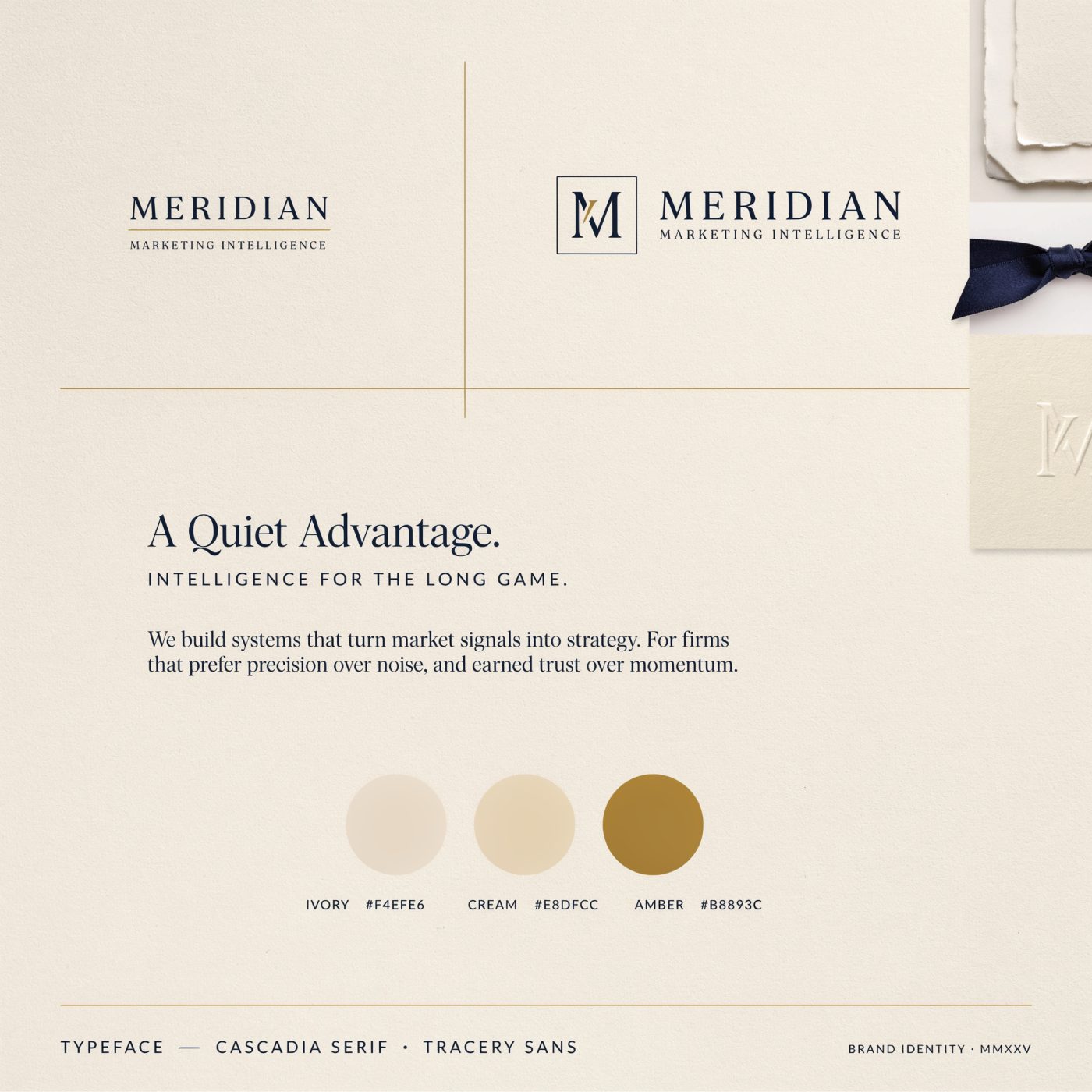
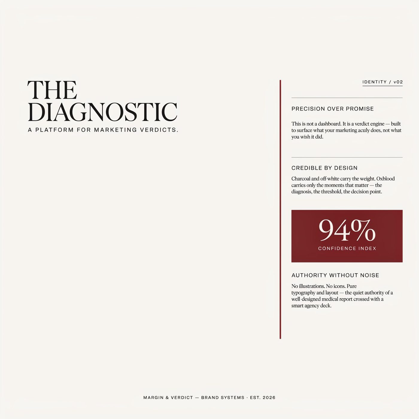

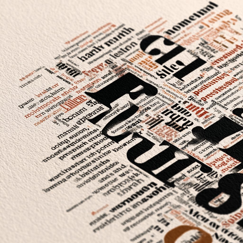
Here's the Sharp Diagnostic prompt exactly as I ran it, so you can see the structure filled in:
Brand identity mood board for a marketing diagnostic platform built by a senior strategist. Clean white background. Charcoal and off-white as the base. One sharp accent: deep oxblood red used on key elements only. Monospace typography mixed with a strong serif display font. Feels like a well-designed medical report crossed with a smart agency deck. Structured. Data-confident. No illustrations or icons, pure typography and layout. The aesthetic of something that gives you a verdict and stands behind it. Precise, credible, quietly authoritative.
Reacting to what was wrong turned out to be as useful as reacting to what was right. I didn't love any direction outright. But articulating why each one missed (too soft, too cold, too tech) triangulated the actual answer faster than a lucky first generation ever could. Go in expecting to reject things. The rejections are data.
When you're torn, change one variable
The mood boards left me with one open question: oxblood red or teal as the accent. This is the moment to resist guessing, and to resist asking your spouse. Run a controlled test instead. The method is marketing 101, and it applies to brand work just as well: isolate the variable. Same brief, same typography, same treatment, change only the thing you're deciding. If two options differ in five ways, your eye can't tell which difference is driving your reaction. If they differ in one way, it can.
Generate two versions of the same brand identity mood board. Same layout, same typography, same background, same photographic treatment. The only difference: version one uses [option A] as the single accent color, version two uses [option B]. I need to compare them side by side with only the accent changed.
One honest note: an image generator won't give you pixel-identical layouts across two runs. What you get is the same visual world rendered twice with one color changed. That's still a controlled test where it counts, because the variable you're isolating is what the color means, and that reads clearly across compositions.
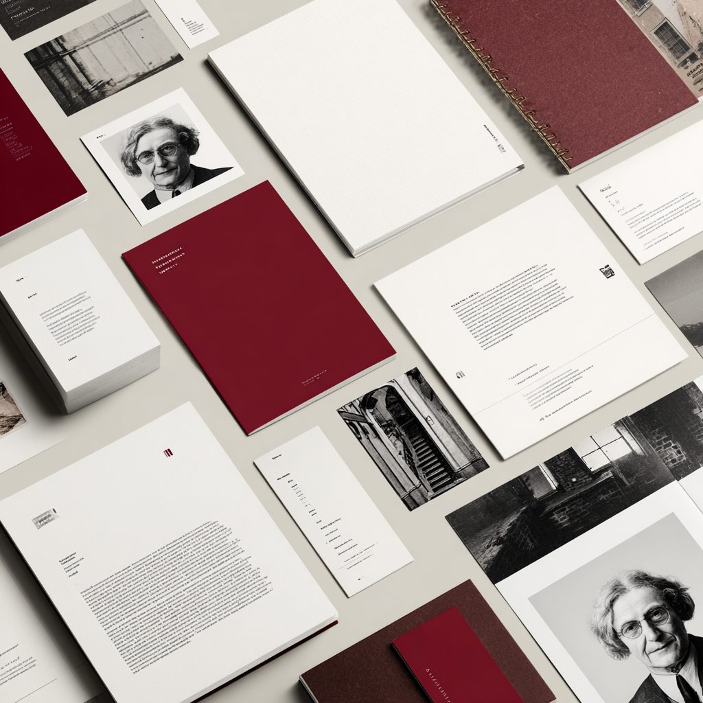
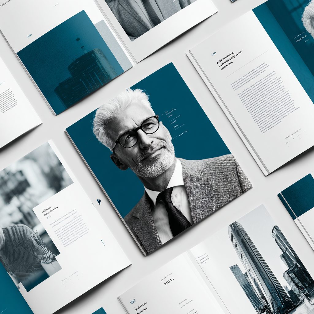
Same brief, one variable changed: the accent color.
Oxblood won, and the side-by-side made the reason obvious in a way that months of squinting at my old site never had. Oxblood reads editorial and medical at the same time, which is exactly the register a diagnostic brand needs. Teal reads as tech, and tech is the most crowded, most generic visual lane in B2B. The teal version looked fine. It also looked like two hundred other companies. That's what the isolated comparison shows you: not which color is prettier, but which one means something.
Step 5: Lock it into a system
A direction you're holding in your head is not a brand. It's a mood you'll drift away from within a month. The last step is to write the direction down as a system: exact values, named rules, explicit prohibitions. Something you could hand to a designer, a developer, an AI tool, or yourself in six months and get the same brand back out.
This matters more when you're using AI tools, not less, because you'll be generating assets continually, and every generation is a fresh chance to drift. The system is what keeps output number two hundred consistent with output number one.
Based on the direction I picked, write my complete brand system as a single reference document:

- Every color with its exact hex value and the rule for when it's used
- Typography: display, body, and data/label fonts, with sizing relationships
- Shape and texture rules (corners, gradients, shadows, whitespace)
- Photography and imagery rules, including what's prohibited
- The voice card from our earlier work, integrated
- Three examples of on-brand vs. off-brand copy for the same message
- A short list of hard prohibitions: things this brand never does, visually or verbally

Write it so someone who has never spoken to me could produce on-brand work from this document alone.
My run: what the locked system says
What mine locked. Warm paper (#eee8de) as the dominant background, with a small family of paper tones behind it for cards and deep surfaces. Ink (#10151f) for text and dark elements, and here's a detail worth noticing: it's a warm near-black, not the navy from my old palette. The navy didn't survive. Oxblood (#7b1e1b) as the single accent, with defined tints for washes and tags so even the accent has rules. Stone (#d2c7b8) for borders and dividers. Serif display type, a clean sans for body, monospace for data and labels, which fits a product whose output is scores and grades. Sharp corners everywhere: no border radius on cards unless it's functionally required. No color gradients, no soft shapes, no glow effects. Black and white photography as texture insets only, never as hero images.
Every one of those rules traces back to an answer from step one. The single restrained accent and the refusal to decorate come from the financial security answer: quiet confidence, already working, nothing to prove. The sharp corners and monospace data come from the diagnostic territory. The absence of urgency mechanics, visually and verbally, is the marketing bro funnel anti-reference enforced as law. That traceability is how you know the system is real. If a rule can't be traced to a decision, it's decoration.
Here's an excerpt from the actual system document, the color tokens with their rules:
paper        #eee8de   primary background surface, warm ivory
ink          #10151f   primary text, near-black with warm undertone
oxblood      #7b1e1b   primary brand color, CTAs, kickers, emphasis
oxblood-wash #f1d8d2   very light oxblood wash, subtle highlight surfaces
stone        #d2c7b8   borders, subtle dividers, secondary surfaces

Do not use: navy or dark-background UI. Rounded SaaS-style
cards with box-shadow glow effects. Stock photos of marketers.
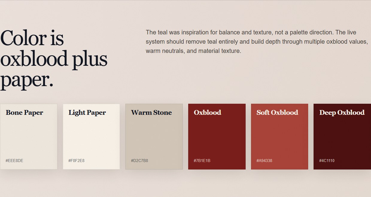
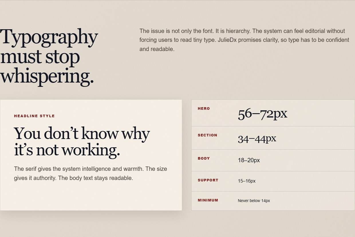
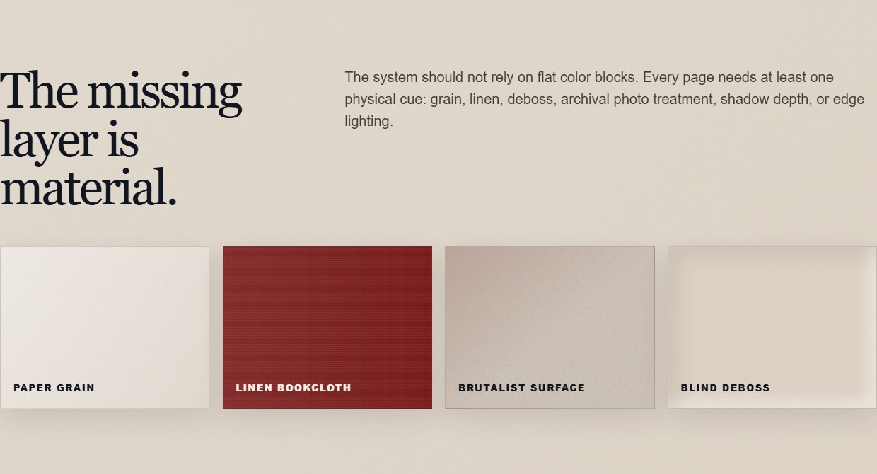
Three sections of the locked system: the palette, the typography, and the material layer. The full document is one page, linked at the top of this article.
The logo comes last
Remember the first rule of Step 4: no logo until the system exists. Here's the payoff. By the time I got to the logo, the system had already made most of the decisions: oxblood, paper, serif plus mono, sharp corners, no decoration. What was left was a real design question with a small answer space, not a blank page.
The locked logo isn't one mark. It's a system of three. A full JulieDx wordmark with a diagnostic label beneath it, for clarity. A compact J / Dx mark for small spaces, which keeps the Julie relationship and the diagnostic meaning together. And the pulse line became a seal for product moments (report cards, diagnosis modules, the favicon), not the main logo. My old pulse-mark logo didn't survive, for the same reason the navy didn't: it pulled the brand back toward health-tech SaaS, and the system said no.
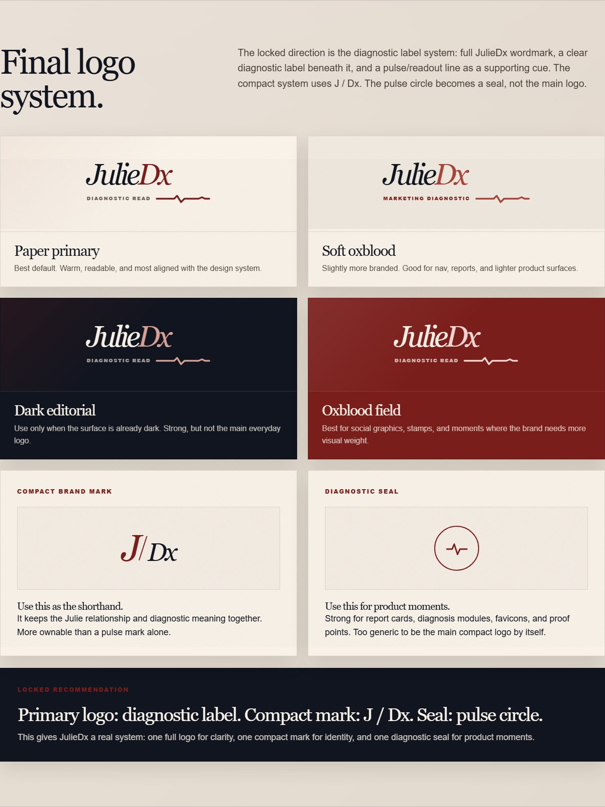
The locked logo system: wordmark with diagnostic label, four approved colorways, compact mark, and seal.
The system pays off: texture
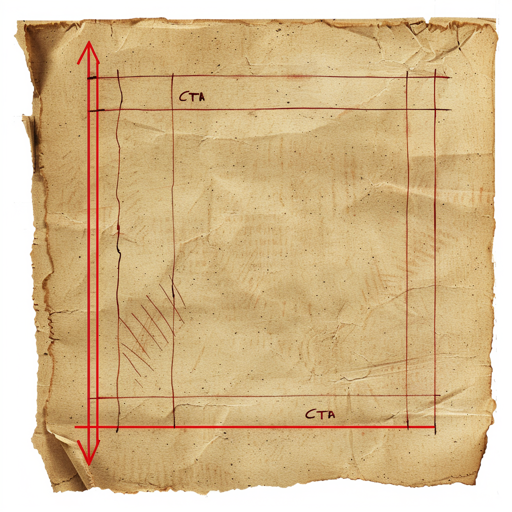
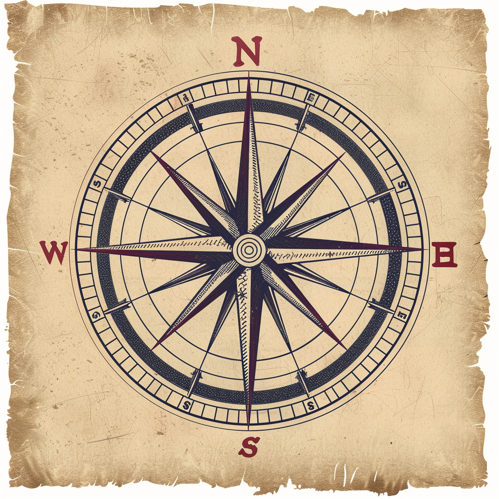
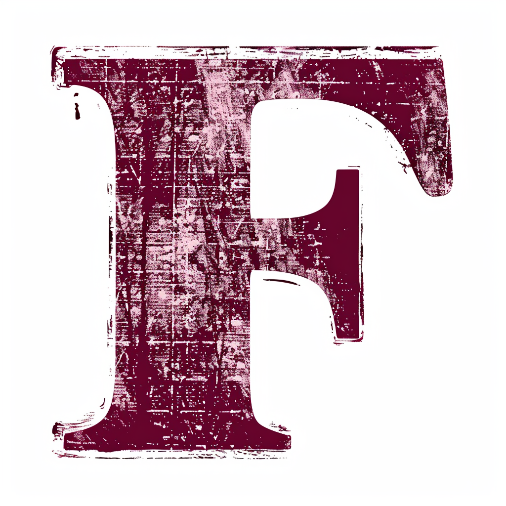
A locked palette and sharp corners give you a correct page, not a page with a soul. The old-fashioned editorial feel of my site, the thing people actually comment on, comes from a texture layer generated entirely after the lock: black and white still lifes of vintage objects, one per diagnostic tool, and a library of paper artifacts (torn cards, clipped notes, rubber stamps, a blind-debossed seal, creases and folds) that make the reports read like physical documents. Twenty-three approved assets, every one generated against the locked system. Here's the actual prompt for the stamped F on my 404 page:
rubber stamp imprint of the single capital letter "F", serif typeface, deep oxblood red ink #7b1e1b, distressed uneven ink coverage with authentic stamp texture, slight rotation, on a plain white background, vintage office stamp aesthetic, high resolution, no other elements --v 6
Look at what that prompt is doing. It quotes the exact locked hex. The generator isn't choosing the red. The system already chose it, and the prompt just carries the decision in. That's the difference between asset two hundred matching asset one and asset two hundred drifting into somebody else's brand.
The texture work failed twice before it worked, and both failures got caught fast because there was a system to check against. Microscopic paper-grain overlays were rejected because you couldn't see them at real product scale, and texture you can't see is just file weight. Paper objects layered on a paper background read as flat white rectangles instead of depth, because a generated asset has to composite with the page, not just look good alone. One rule kept the whole layer honest: grades, scores, and copy stay live text on top of the textures, never baked into the images. The texture is a stage. The diagnosis performs on it.
One vintage still life per tool:


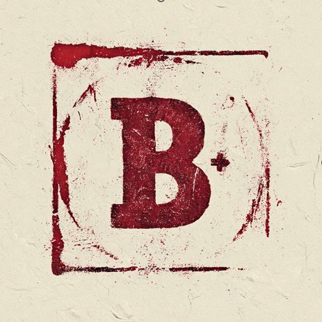
The paper and stamp layer:





Before and after
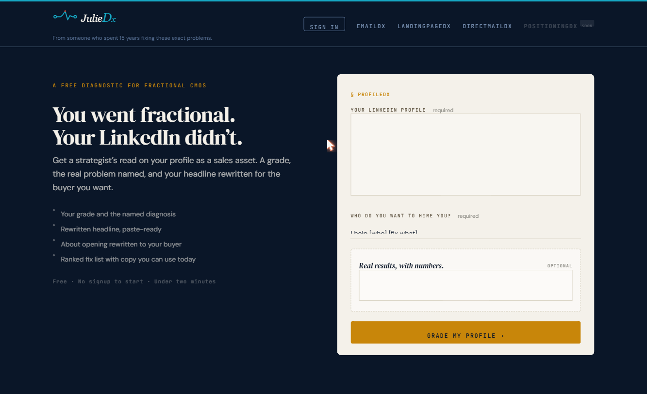
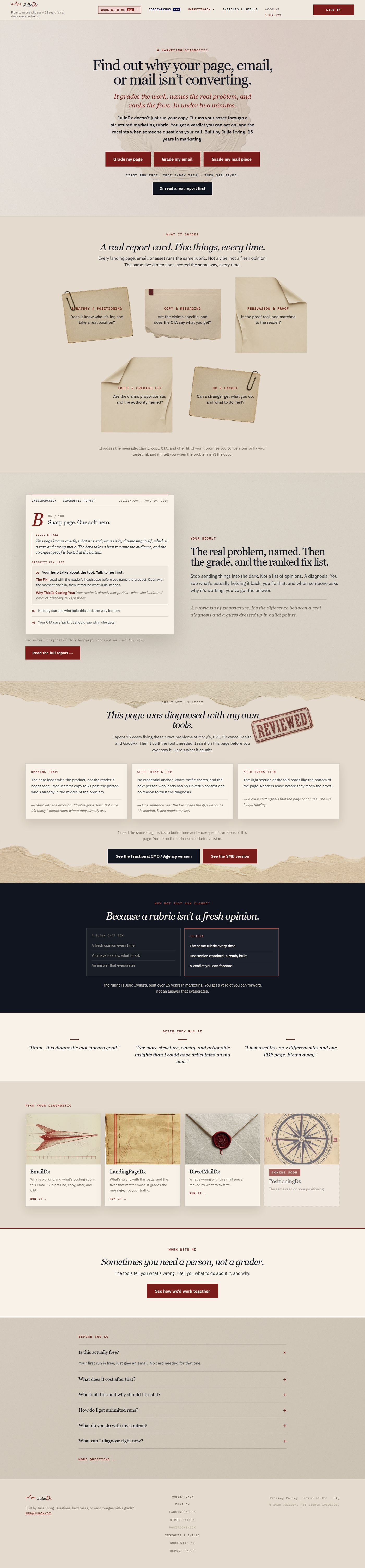
Before and after. The before is a tool page from the old site, the truest full-page capture of the old navy and teal system that still exists. Same brand, same system, before and after the process.
The playbook
- Get interrogated before you generate anything. The brief is the work.
- Pressure-test your answers. At least one sounds specific and isn't. Make the AI catch it.
- Build the voice as rules, not adjectives. Decide first whether the voice is you or a persona you're inventing, then extract it or define it.
- Generate territory before logos. Multiple named directions, each testing a real question. When you're torn between two, change one variable and compare.
- Lock it into a written system. Exact values, explicit rules, traceable to your answers. That's what keeps generation two hundred looking like generation one.
So that's what I should have said in that room. The site doesn't look like AI designed it because AI didn't design it. It built exactly what I told it to. The telling is the work, and now you have the script.
Everything you just read is how I work. If you want more of it, my newsletter goes out every week: what I'm building, what I'm testing, what's actually working in marketing right now.